
Connected Television Sign-In and Registration
A new doorway into world-class entertainment.
Client
HBO
Role
User Research
User Experience
Visual Design
Launched
Spring 2020
Background
Respond and React.
My previous project involved developing an second screen authorization feature to support HBO's content partners and to make the sign-in process easier for our subscribers. While I successfully solved the problem for our content partners, I got strong feedback from our hardware partners over the feature. The feature put future HBO NOW releases on our hardware partners at risk. And I knew from previous interactions that this problem would continue to evolve with other partners.
In addition, significant customer confusion persisted. While the intent was to make the sign-in process easier for our customers, many customers still wanted the option to enter credentials on their device, and found the second screen experience confusing. Which led to a dramatic increase in customer service calls and online help requests.

I will be canceling my account. Don’t know why you have to overcomplicate things. There should be a way to sign in directly from my console!! Hulu is getting my money now!
Twitter, February 2018
53%
customer service calls related to registration
21%
calls exclusively related to television clients
I needed to solve this, and I needed to solve it quickly.
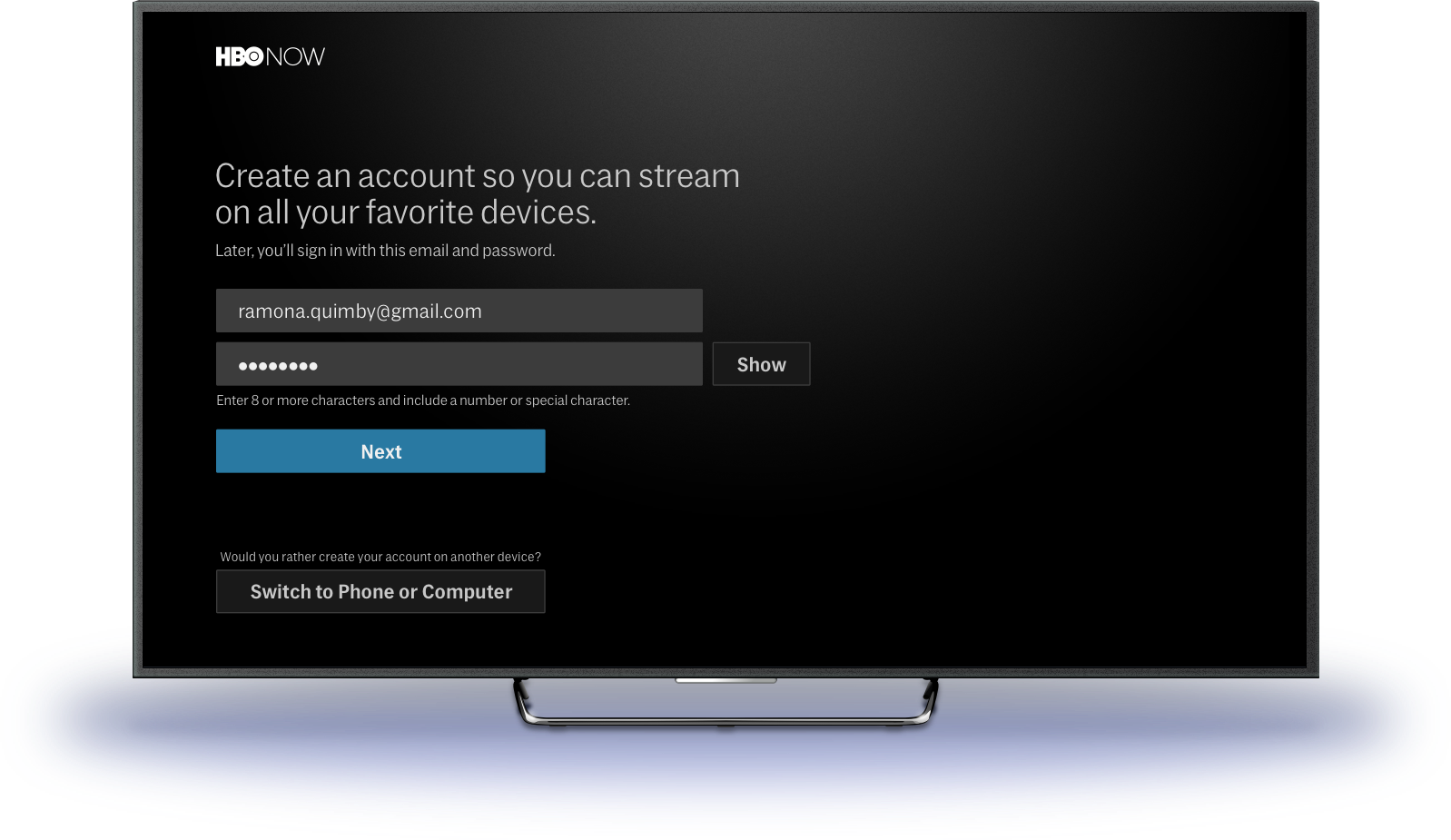
The challenge was threefold. First, I needed to create a brand new registration and sign-in experience for our television plaforms, including introducing support for on-screen keyboards. Second, I needed to leverage the strengths of our hardware platforms, from Roku's account management to tvOS' remote keyboard. Finally, I needed to continue to support off-device sign-in experiences from our content partners such as Prime Video Channels.
Explorations and Testing
Threading the Needle.
In addition to building support for native OS keyboards, something that previously didn't exist on our platform, I encounted another challenge interally.
Our customer service team wanted us to collect light demographic information to ease in account recovery when helping customers. However, several of our hardware partners were uncomfortable with that ask. While those discussions were being handled, I needed to find a solution for both.
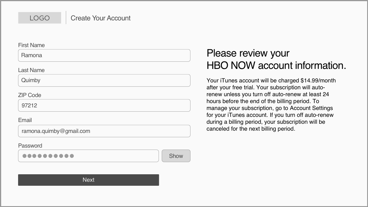
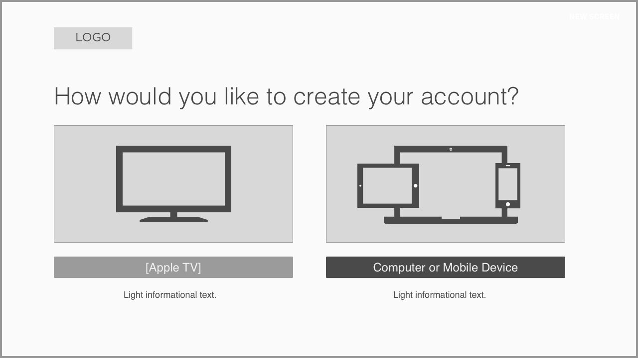
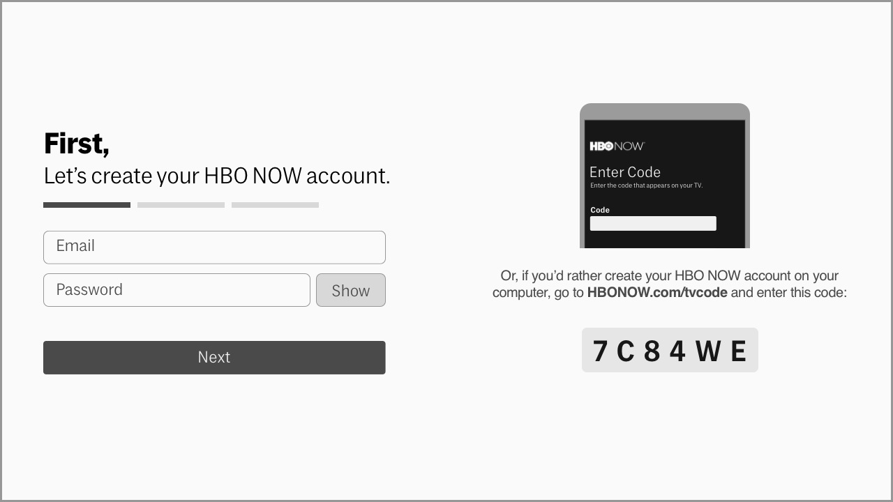
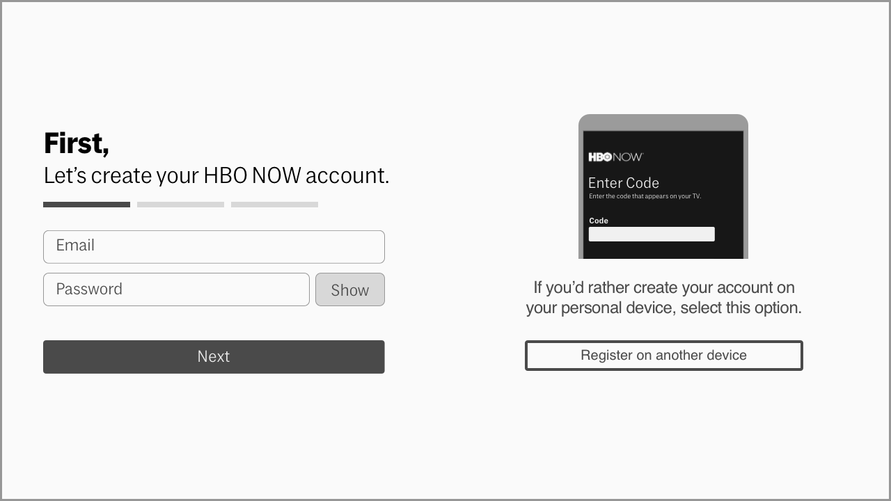
Separating the registration funnel into two screens allowed the product team to continue supporting the customer service team while discussions with HBO legal/customer service continued. Should those teams come to a resolution, the identification screen can be removed with little overall impact to the experience.
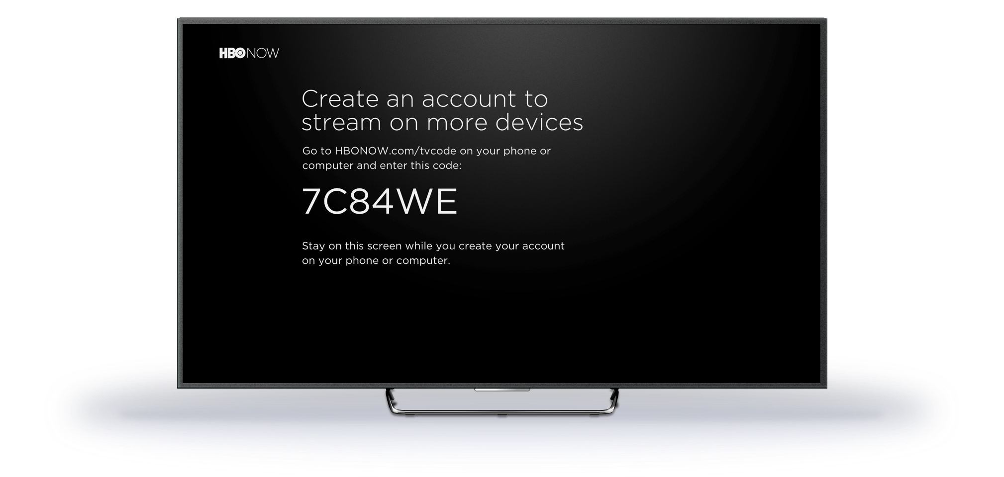
In addition, I included an option for a second screen experience to support our specific content partner's request, as well as providing an option for customers who preferred that method of signing in to the product.
Final Designs
A refined experience.
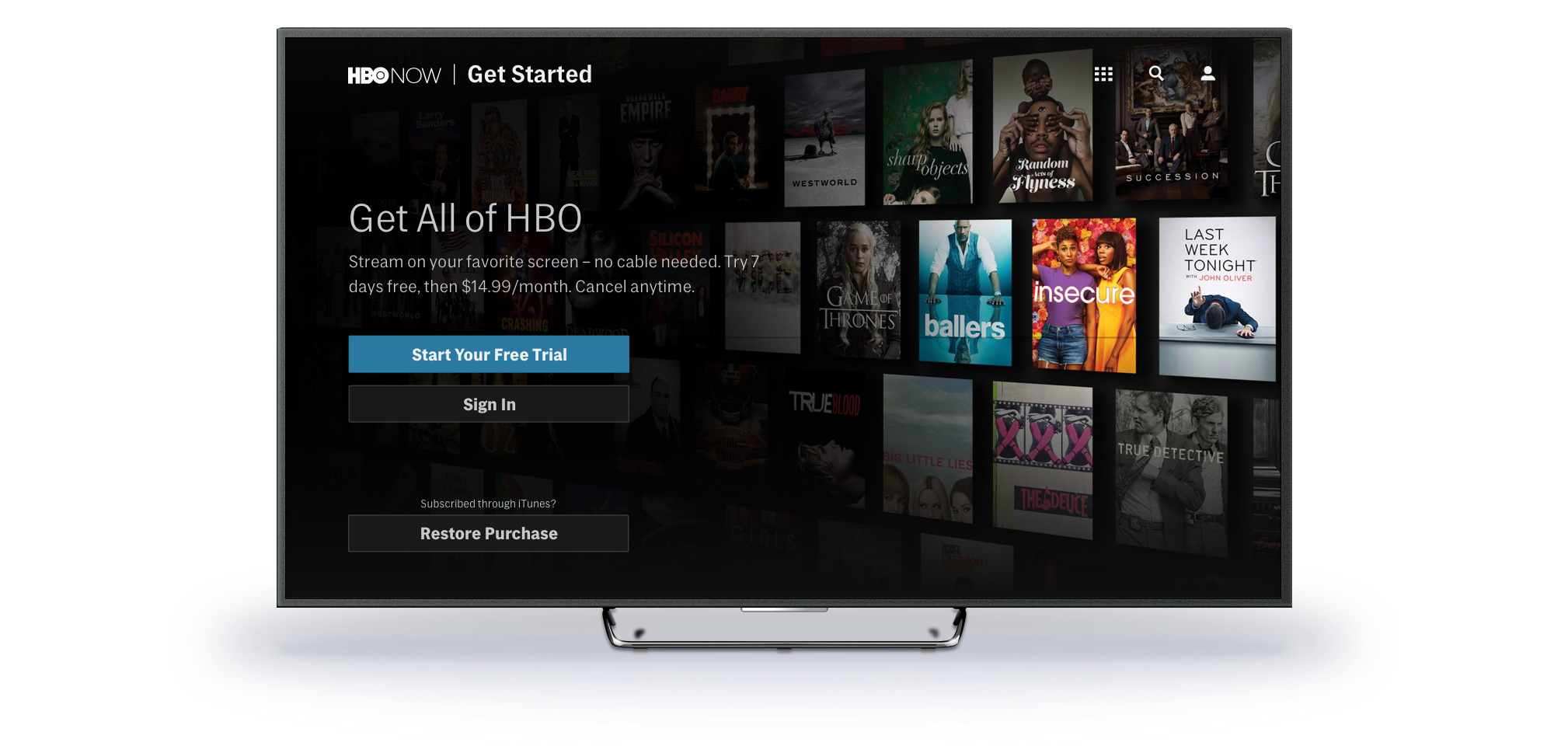
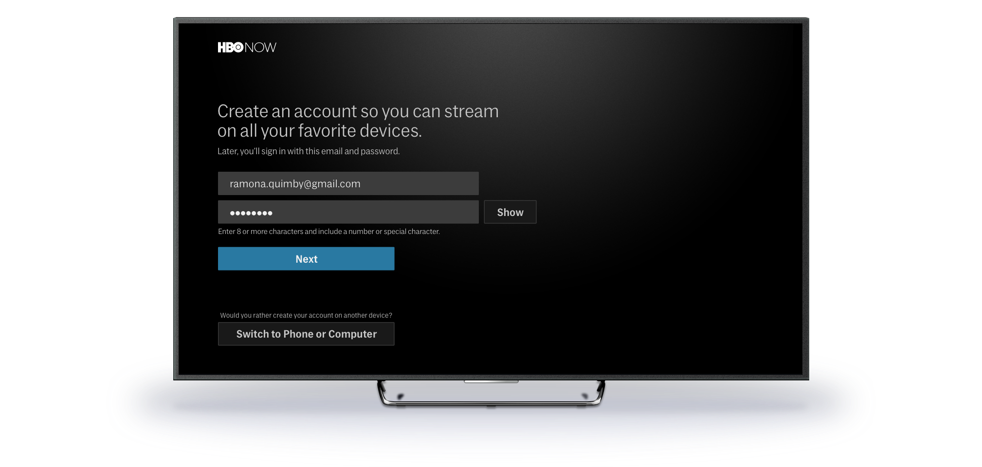
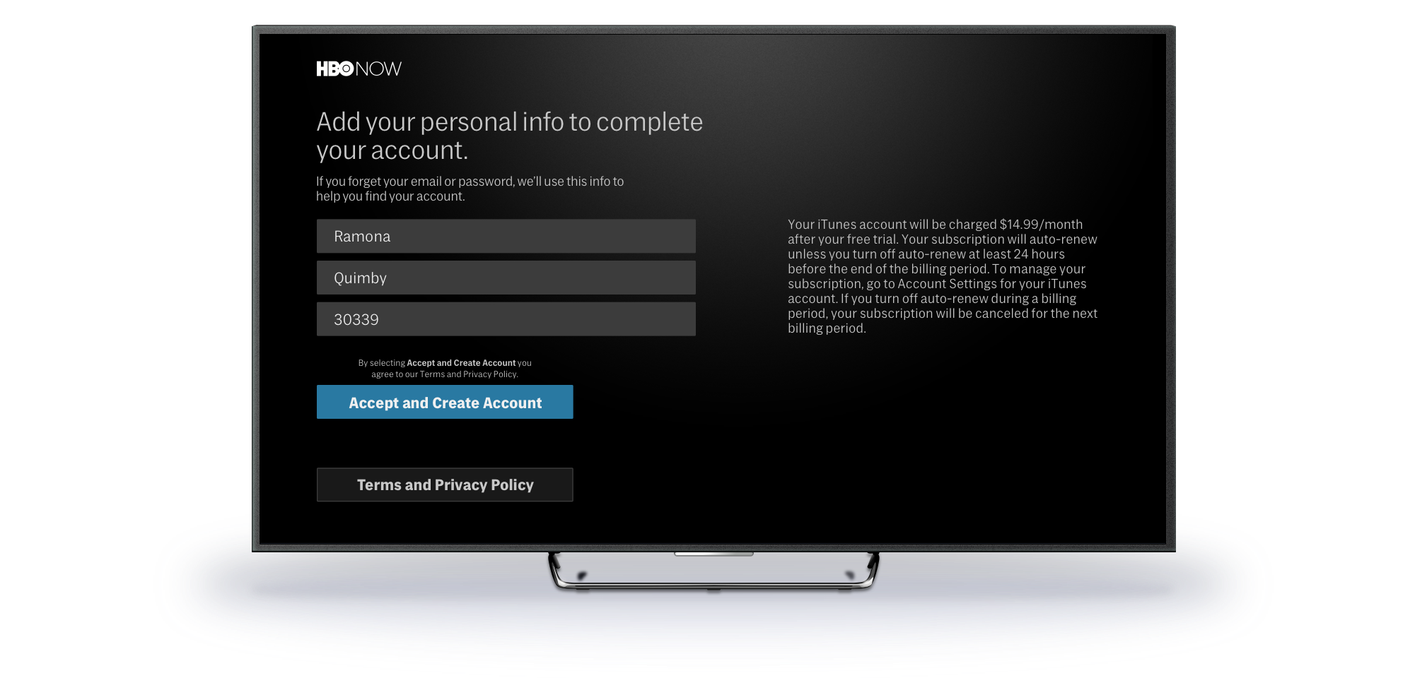
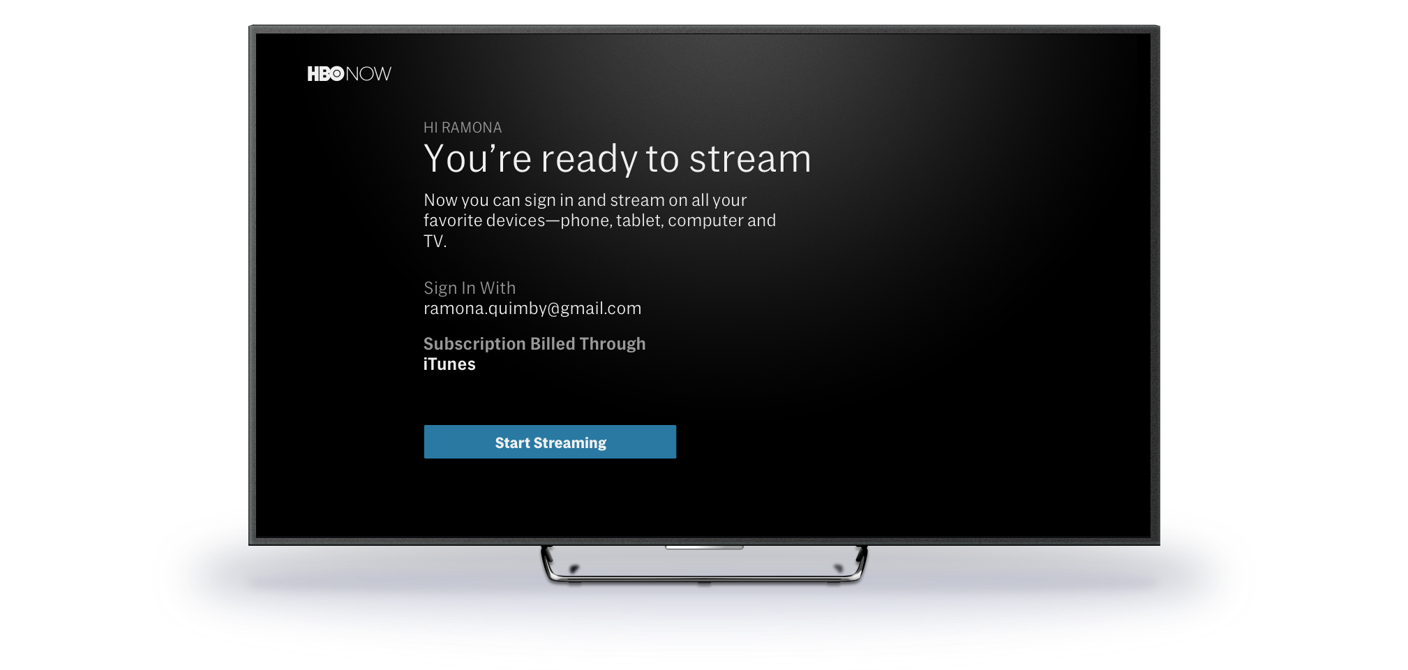
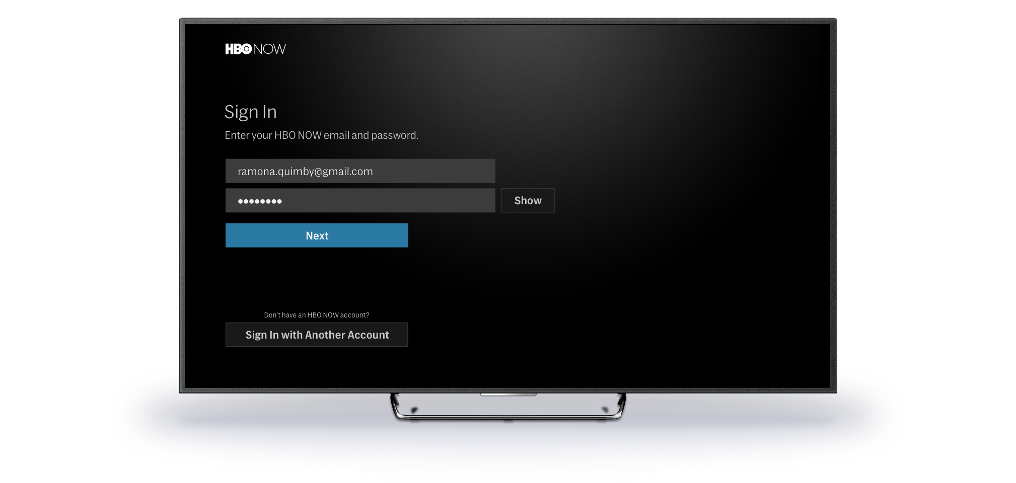
The final product reflects months of work refining and improving our team's entire registration and authentication experience. The new experience supports both on-device and off-device interactions, provides a gateway for HBO's content partners, while resolving the concerns of their hardware partners. In addition, it provides a path for an even more streamlined registration experience by removing some of the overhead that was being passed to subscribers.
Post launch, HBO saw an immediate decrease in customer service calls surrounding this issue. Over the following months, the trend continued in a positive direction.
40%
drop in registration calls from May - June 2018
65%
drop in registration calls by August 2018
Dwight Battle
Let's get in touch.
Phone: (425) 466-3401
Email: hello@dwightbattle.com
Twitter: @dwightthemayor