
Reinventing entertainment
at 40,000 feet.
Reinventing the in-flight entertainment experience.
Reinventing the in-flight entertainment experience.
Reinventing the in-flight entertainment experience.
AGENCY
Ratio
CLIENTS
Skycast Solutions
Alaska Airlines
Microsoft
ROLES
Lead product designer
User experience design
LAUNCHED
February 2015
THE PROJECT
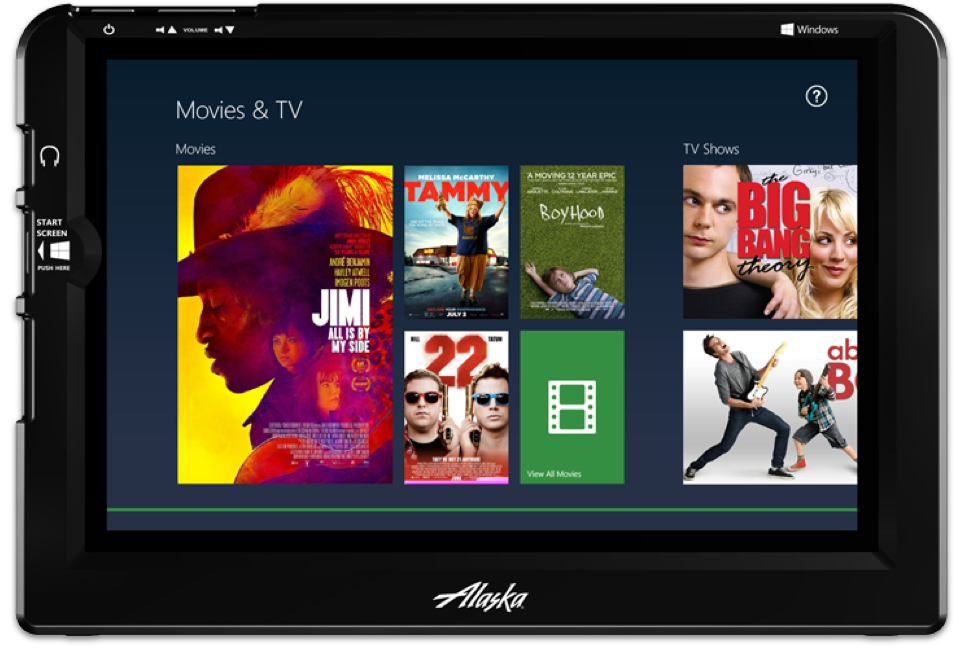
Skycast Solutions turned to Ratio to replace their dated and aging DigEplayer device for Alaska Airlines. Working with Microsoft, we created a tablet experience to drive on-demand movies, television shows, music, magazines, and games to provide a first in class entertainment experience.
I was picked to lead the creative direction of the product, which replaced the existing in-flight devices with custom applications on a Windows tablet. I managed a team of designers responsible for creating initial creative explorations, wireframes, site maps, and comps. I worked closely with the client and partners to present work, manage expectations, and address any client concerns.
In addition, I led the agency's first-ever user testing initiative. Spread over two days at the Alaska Airlines' first-class airport lounge and corporate offices, I led a usability test using a prototype of the proprietary Alaska-branded apps as well as the Windows 8 device that will be used in the final product. I then presented those results to the client with customer feedback, test results, and recommendations for improvement.
EXPERIENCE GOALS
- Optimize user experience for battery life and cabin environment
- Utilize benefits of Windows 8 experience, while minimizing limitations of the OS for guests
- Provide for easy access to movies, television series, games, magazines, music and in-flight connection experiences (in-flight WiFi)
- The experience needed to be customizable to support future airline brands
FRAMEWORK
FRAMEWORK
The overall challenge with this project was to combine the power and versatility of Windows 8 with the ease, usability, and luxurious feel that Alaska’s guests have come to expect with the airline. In addition, we were working with hardware that was unfamiliar to Alaska’s guests, as well as building bespoke Windows apps that could sit alongside stock Windows apps without causing any confusion for Alaska’s guests.
Early research showed that Alaska’s guests were largely iOS and Android users. While they were familiar with Windows, they were largely unfamiliar with Windows 8 and its features.
Because guests would be using stock Windows apps in addition to our own, we decided to stay fairly loyal to the Windows design ethos, while adding a couple of tweaks to ease discoverability and usability.
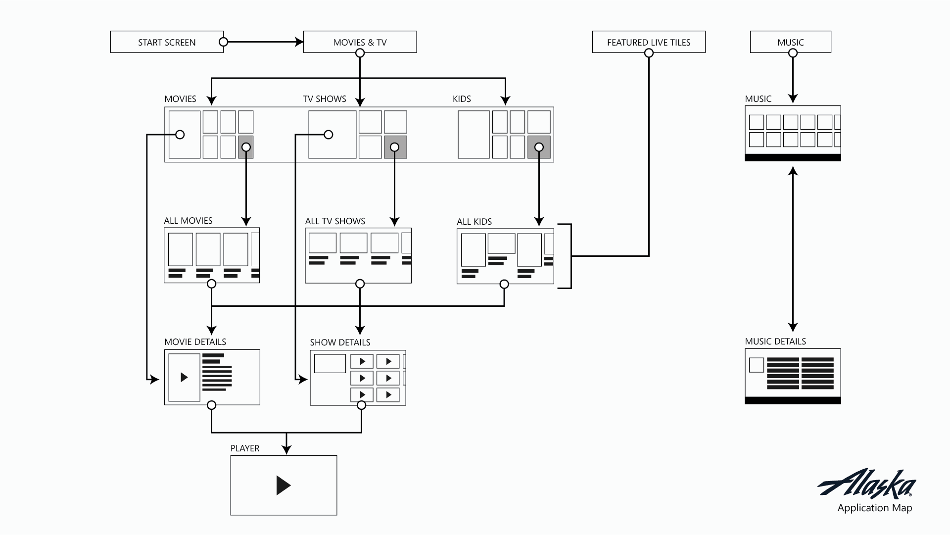
USER JOURNEY
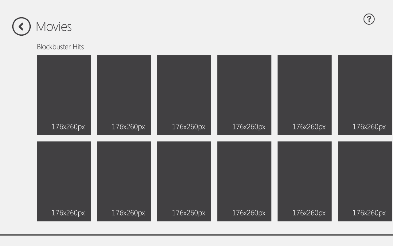
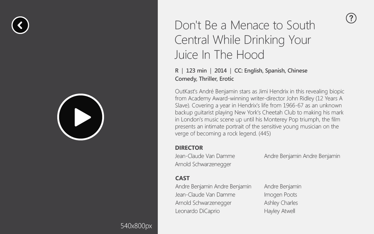
WIREFRAMES


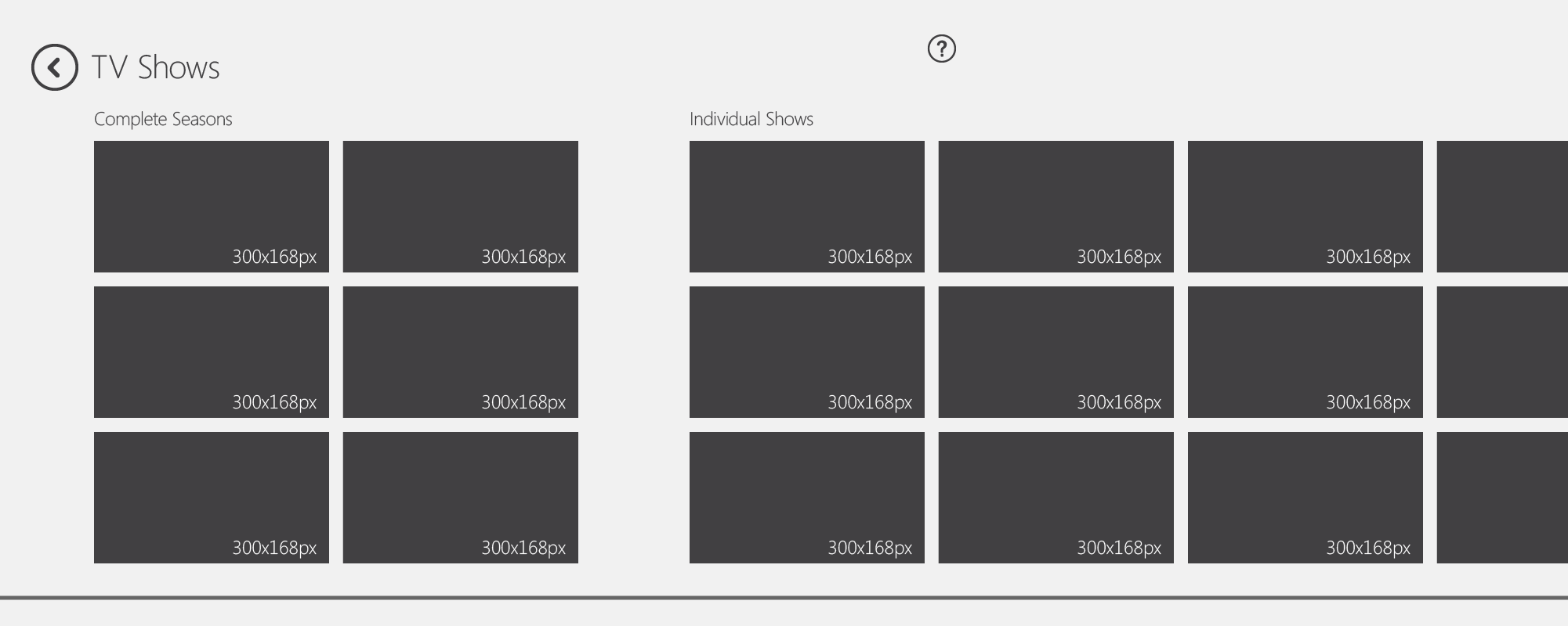
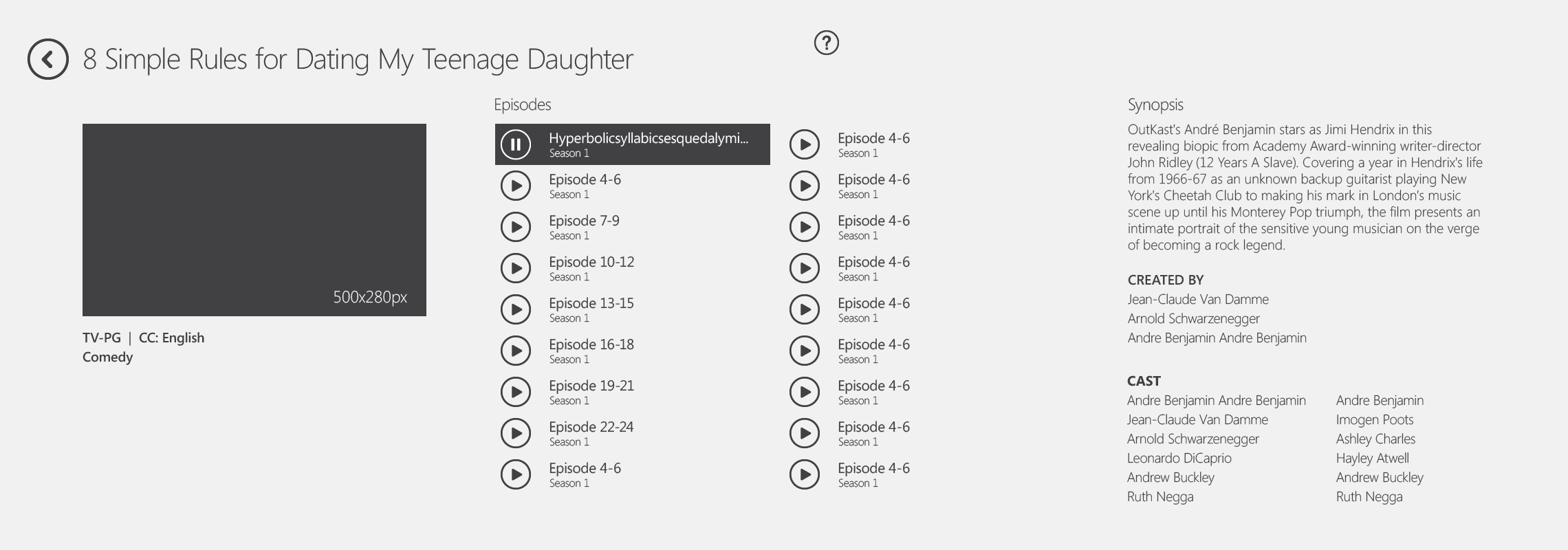
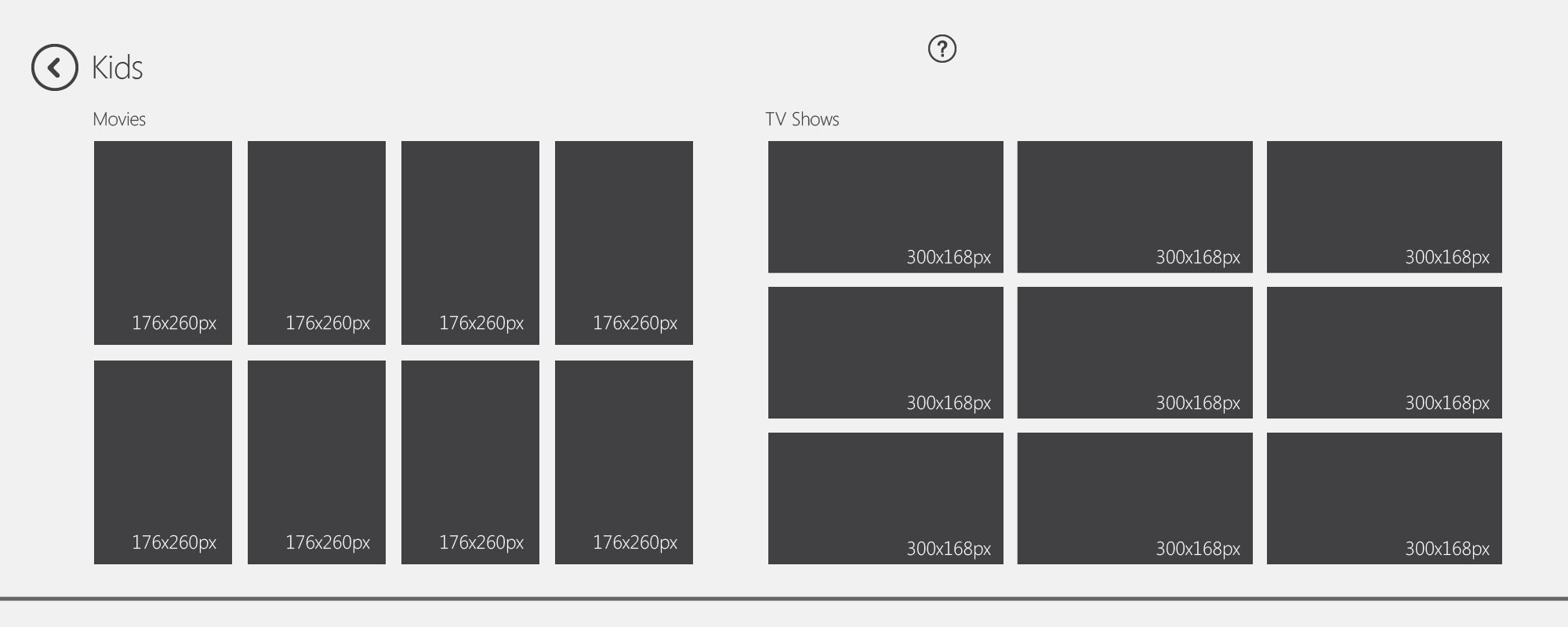
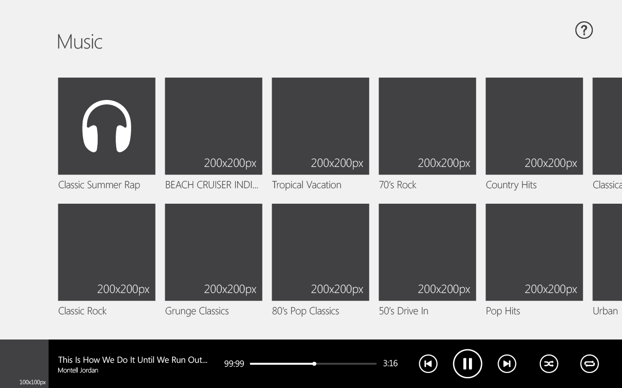
VISUAL DESIGN
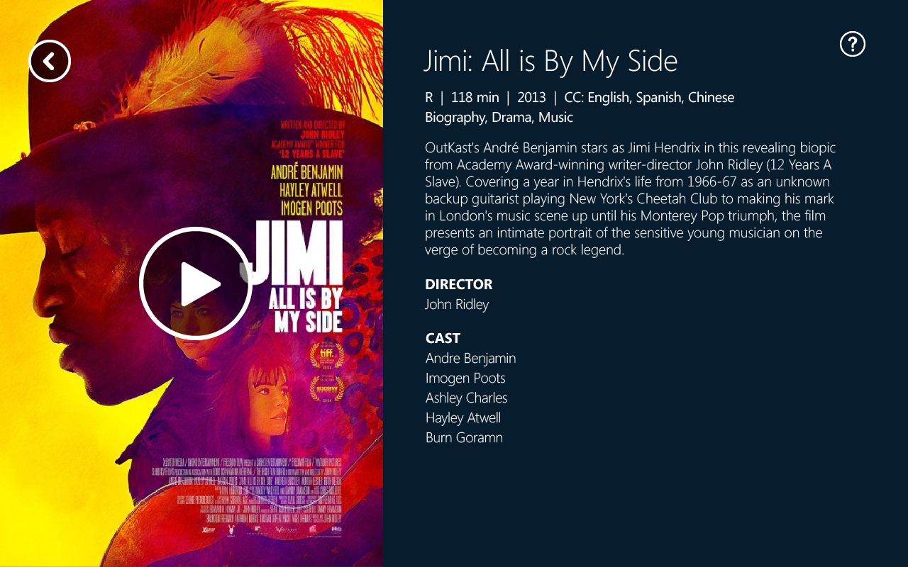
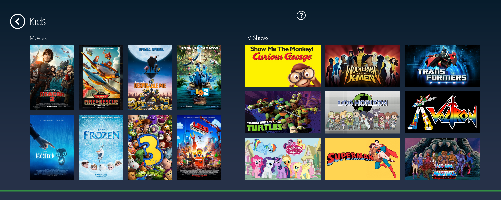
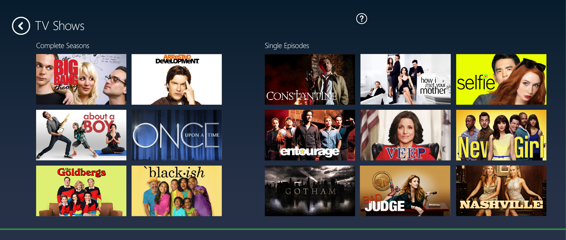
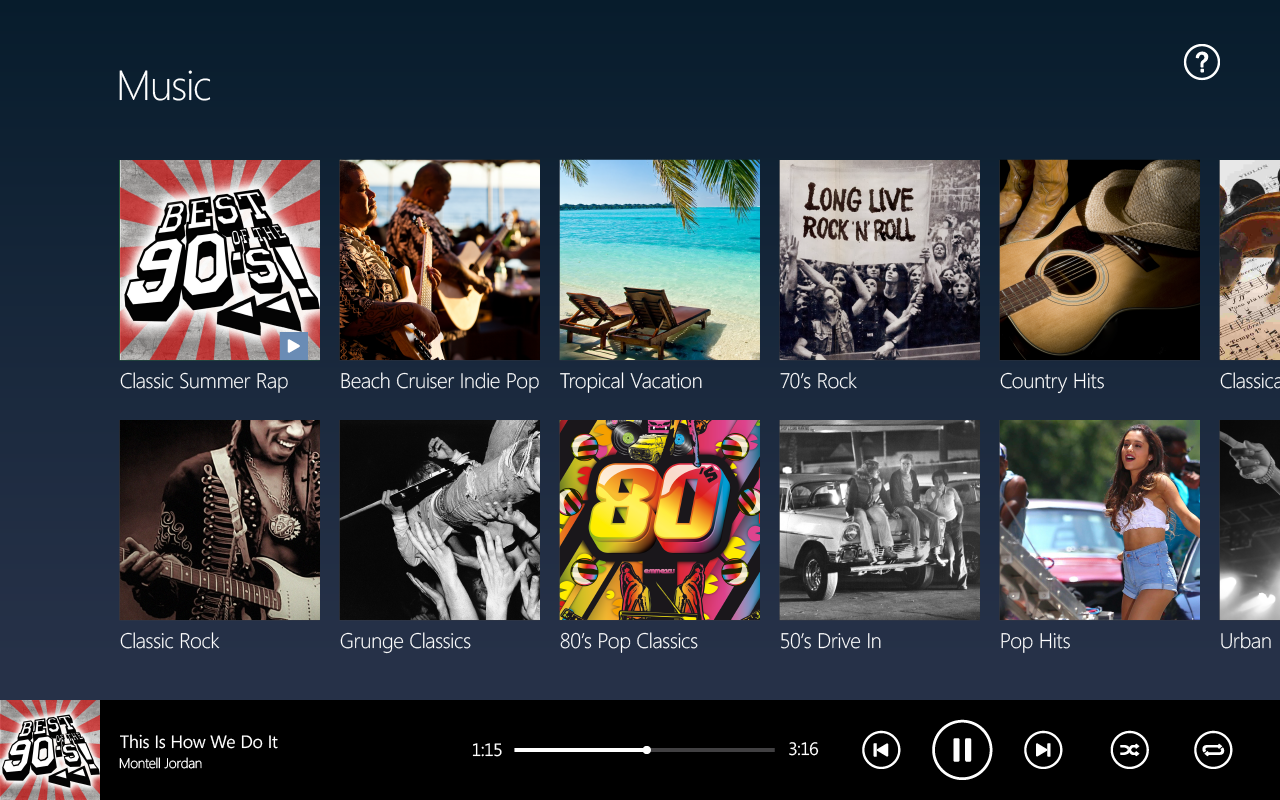
I wanted the overall interface to be darker, as these would be used in the darker environments of airline cabins. We combined that dark background with Alaska’s brand colors. We used the Windows standard Segoe font, as it provides clear readability and ties the entire experience together.
I wanted the overall interface to be darker, as these would be used in the darker environments of airline cabins. We combined that dark background with Alaska’s brand colors. We used the Windows standard Segoe font, as it provides clear readability and ties the entire experience together.

Breaking Windows Conventions
Research showed that users were unfamiliar with the Windows 8 home screen, so we introduced visual cues to invite the user to swipe to view more content on the home screen.
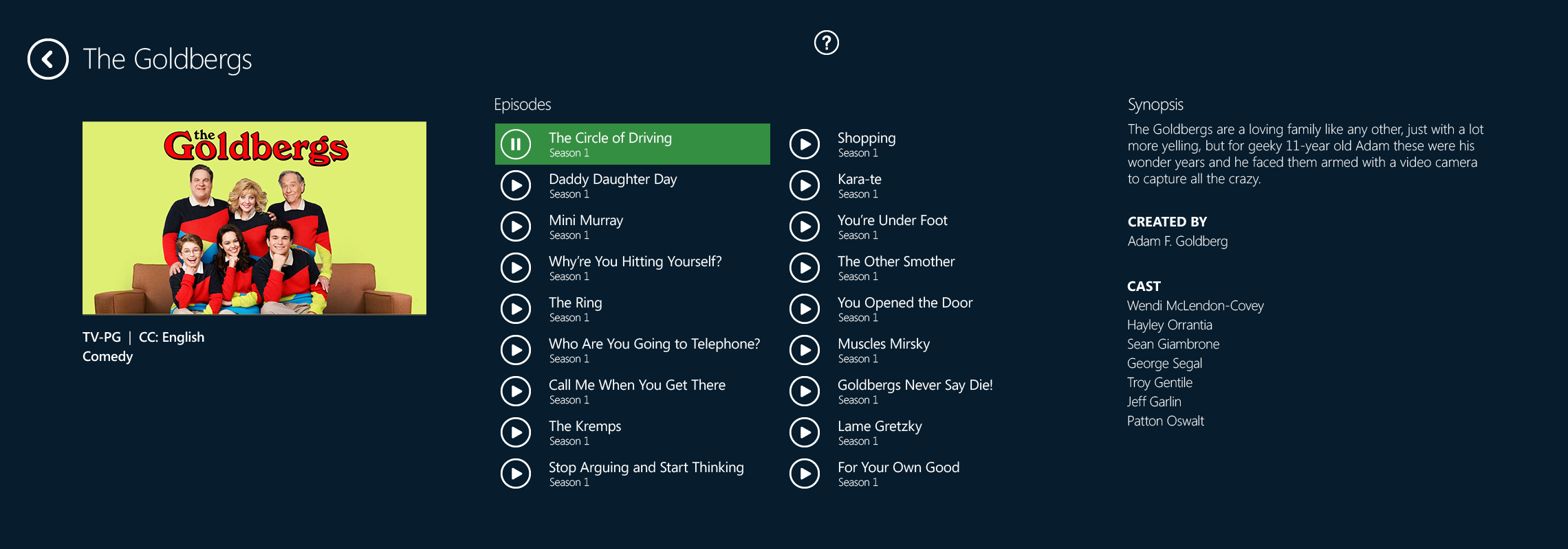
We also made the icons/buttons 25% larger than the standard Windows buttons to make them easier to see, and to increase success when interacting with it.
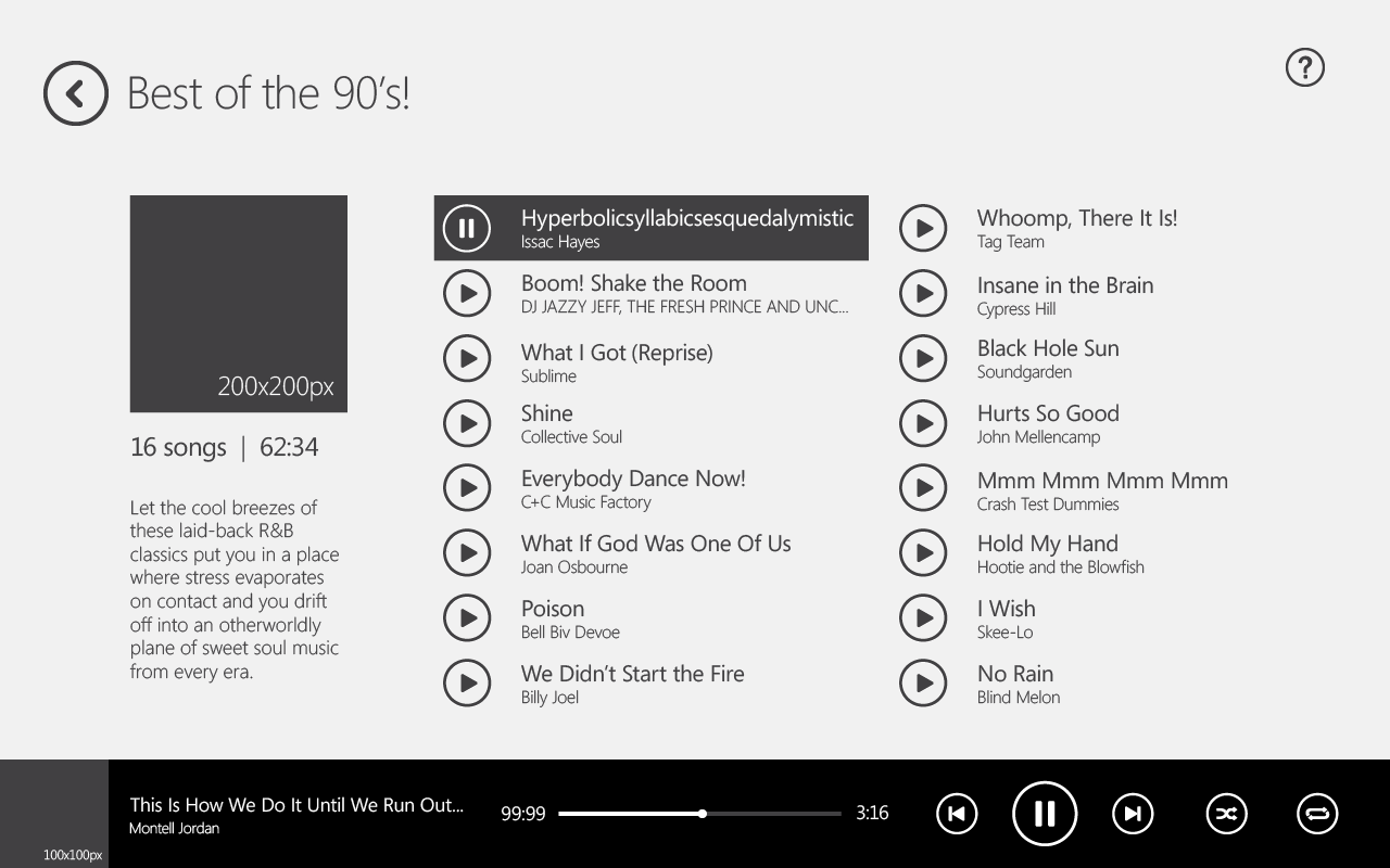
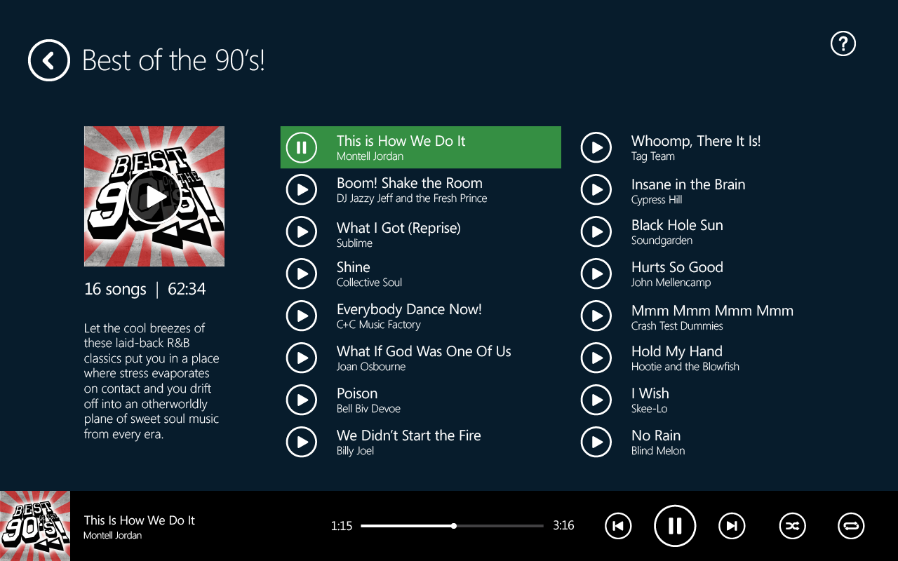
In the Music app, we also noticed that users did not recognize a list of items as being actionable, so we added play buttons to all episodes and songs.



TESTING
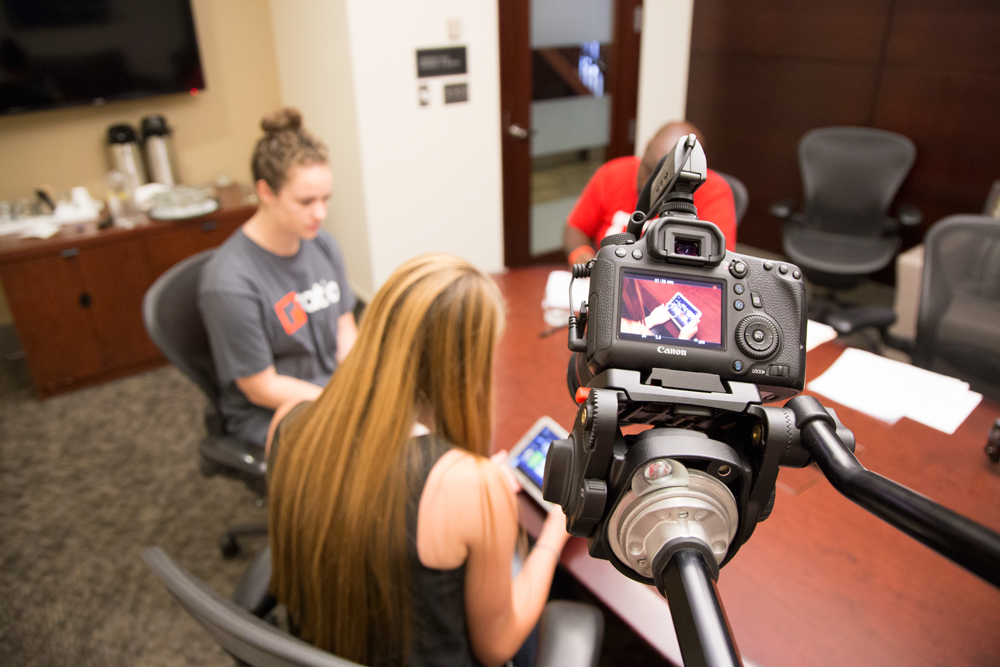
To validate our design and strategy decisions, we held a series of testing sessions at Seattle/ Tacoma International Airport with Alaska travelers.
We wanted to test the accessibility of the hardware, as well as the usability of the Windows interface with novice users and the overall usability of our bespoke Movies and Music apps.
We then presented our findings to our partners with customer feedback, test results, and recommendations for improvement.
LAUNCH
The device launched on Alaska flights in early February of 2015. 7,000 devices launched simultaneously on cross-country flights. To date, feedback from customers and flight attendants has been unanimously positive.
The device launched on Alaska flights in early February of 2015. 7,000 devices launched simultaneously on cross-country flights. To date, feedback from customers and flight attendants has been unanimously positive.
Dwight Battle
Let's get in touch.
Phone: (425) 466-3401
Email: hello@dwightbattle.com
Twitter: @dwightthemayor